

I really like this but i don't actually know why because its simple to make and the fact isn't that great. Its just a good effort. I think the point of this work is to create humour as personally I find it difficult to imagine choking on a ball point pen. - Marion Deuchars
http://www.creativereview.co.uk/cr-blog/2011/august/last-chance-to-learn-something-every-day
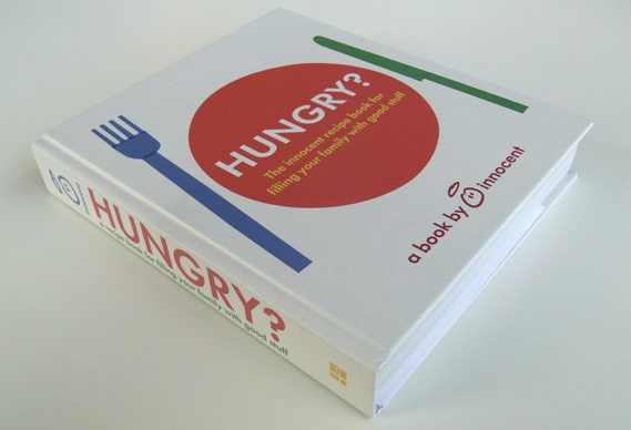
 Innocent's new hungry book, the books purpose is to inform/ entertain. The graphics are clear and simple. I like Innocents branding and I think its quite successful in creating an 'innocent' identity. The design feels clean and strong. It has good use of colour.http://www.creativereview.co.uk/cr-blog/2011/july/innocents-new-hungry-book

 This is sweet. Poland has invited lots of street artists to decorate the city of Lotz. The geometric shapes looks good and the colour scheme works.
http://www.stumbleupon.com/su/2MGpgW/www.juxtapoz.com/Current/this-is-a-photograph-not-a-painting
http://www.creativereview.co.uk/cr-blog/2011/august/last-chance-to-learn-something-every-day

This is another Nation of Shopkeepers advertisement. This was created using a screen print which I'm interested in. The print is about A4 size. The patterns look excellent.
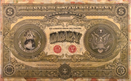
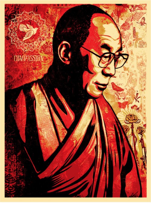
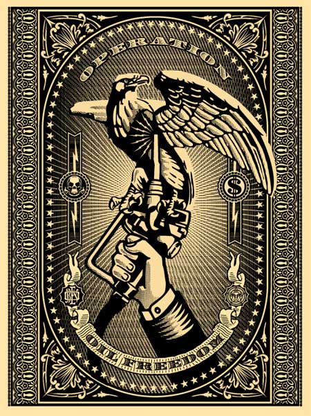
Shepard Fairey focuses on more political subjects which can be quite controversial. I love the detail in his work and like the clothing line OBEY. The colours Fairey works with are generally reds, blacks, money green or white.
http://obeygiant.com/archiveshttp://www.stumbleupon.com/su/2MGpgW/www.juxtapoz.com/Current/this-is-a-photograph-not-a-painting
No comments:
Post a Comment