Showing posts with label ppp1. Show all posts

Sunday, 27 May 2012

Speaking from Experience - Crit Amendments

I made the header which was also an explanation more clear and understandable. I think Finance was a bit confusing. I changed this to Student fiance payments. I also specified graphic design 1st year students.

From the final crit in 'areas for improvement' someone said 'Change the red at the bottom because the numbers are becoming lost' - meaning that the red was clashing with the orange especially when printed because of the printers capabilities, the red wasn't as vibrant as on screen so it was a little lost. I changed the orange to sun yellow. 

Someone said that 'If the dates change on the poster, the poster becomes irrelevant' this is true so I made a set of stickers which would accompany the calender and mean that if the dates for student fiance changed for example the user could simply place a sticker on the calender and amend the old date.


Speaking from Experience - Final Crit


Happy with the crit results. In general people agreed that the idea of the calender was a good idea and they visually like the way it looked. 


Strengths
'Important concept. good use for it as briefings are the one thing you dont want to miss as their weekly'

'Clearly mapped out information. Starts + ends correctly - Reliable, specific information.' 

'Size is perfect'

'Gradient colour works well, legible and clear'

'Thorough research and conventional design'

'Clearly presented'

Areas for Improvement
'concept stamement board needs more work and more details'

'Writing about your secondary research is important '

'Maybe make a way of making the calendar more dynamic so that if a date doesn't change it wont be irrelevant' 

'Change the red on top of the orange because its hard to read' 

'Include weeks' 

'Experiment with gradient, see if colours fit the CMYK more'

Thursday, 24 May 2012

Speaking from Experience - Calendar Design

I created this gradient as a point to start. I am trying to use more colour in my work as I havnt experimented with colour that much this year.  I was trying to create a gradient with colours which fit the seasons and weather of the year.

I made this white box template in Illustrator and used it as a guide for my dates. Working across two programs. I don't know whether this is good practice but it makes in easier for me.


Here is my gradient from the gradient tool option.

  
This is the final ready for the crit. hopefully it goes well.

Speaking from Experience - More Research

Oscar Diaz - This calender is amazing. This calender uses osmosis to represent the passing of days. Each day a new date is highlighted with the purple ink traveling through the numbers of the card. Great idea, wish I had designed this.

Just looking at some gradient examples.

Thursday, 10 May 2012

Speaking from Experience - Research

Hungry Lab

 Justgonesix

Stephen Turbek

Yurko Gutsulyak
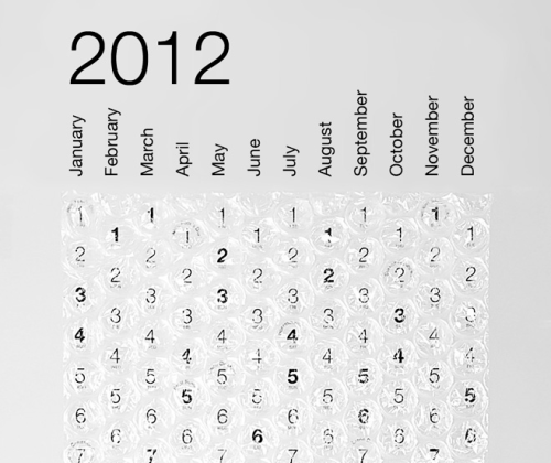
Energy Calendar

Colour Caledar

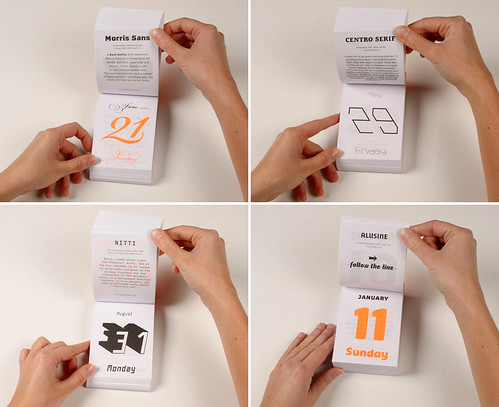
 Typodarium 2009

Imbroglio Calendar
http://www.twentytwentyone.com/

No idea who this is it wasn't referenced. 

Mash Creative

This was labelled as 'Hard to Read Calendar'...

Delicious Design League

No reference

Jason Wilkins

Friday, 27 April 2012

Speaking From Experience// Secondary Researh

Martin Lewis from Moneysavingexpert.com
This is an online form which helps the user manage their expenditure. You enter your income and then your expenditure information ranging from bills to smoking allowance into the online form and it will calculate how much money you have each month. Its a pretty detailed useful resource... If you can be bothered to do it and check it. Its basically a spreadsheet which has been programmed ready for the user to work.

This money management tool is useful because you can save your expenditure and return back to it tweaking it when your circumstances change.